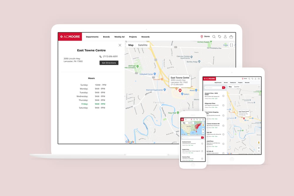
Store locator usage varied depending on the platform the user utilized. Touch device users are more likely to interact with the map; zooming in and out of locations instead of entering any personal information. Desktop users, however, almost always immediately entered a zip code or city to find their nearest store.
This resulted in needing to find a nice blend of the two that would work across all devices, with basic requirements:
- List of all available stores
- Search input that accepted zip code, city, and/or state
- Interactive map with click events to view location information
Over 65% of our user base browse the site through their phone or tablet, so the interactive map took priority (and the majority of the screen real estate.) Doing so resulted in using a two column flexbox grid, which could stack on slimmer devices.


